Ecommerce
Research / UX/UI
My role
UX/UI Lead
The team
UX/UI designer, Visual designer, e-commerce manager, engineers
Context
Callaway Golf had just acquired Jack Wolfskin, a well-known German outdoor brand, and we had to create and launch a US e-commerce website adapted to the US audience.
Date
2020
Results
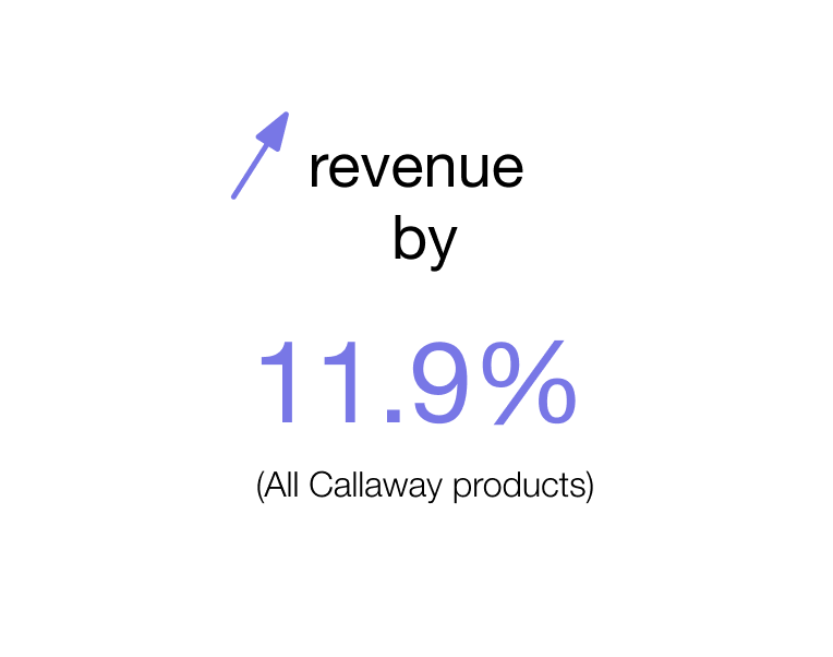
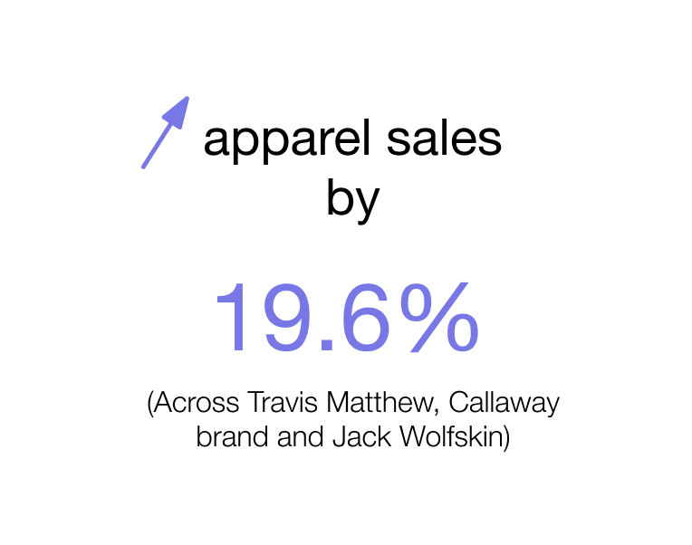
Source: PR Newswire
OVERVIEW
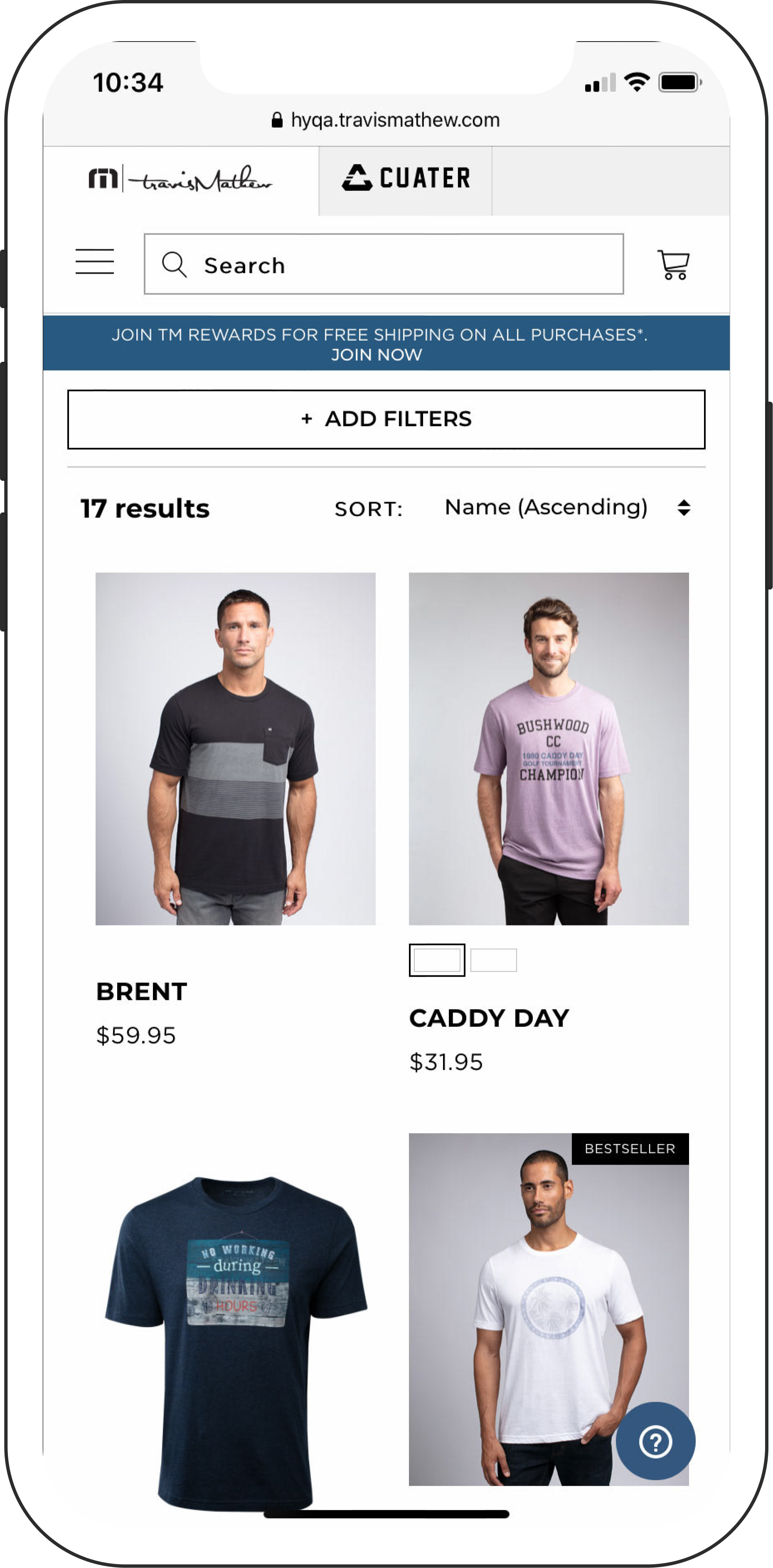
Using assets and visual guidelines from Jack Wolfskin Europe, and a Hybris template from another brand that Callaway acquired.
A very short timeline - 4 months
Constraints
GATHERING RESEARCH &
MARKETING
Several surveys had been created and sent to US outdoor enthusiasts in the past by the Research team at Callaway. From the results, this is what we learned about our main target:
. Below 35 years old
. Single or household with young children
. Accessories are high on their list of purchase
Who are the users?
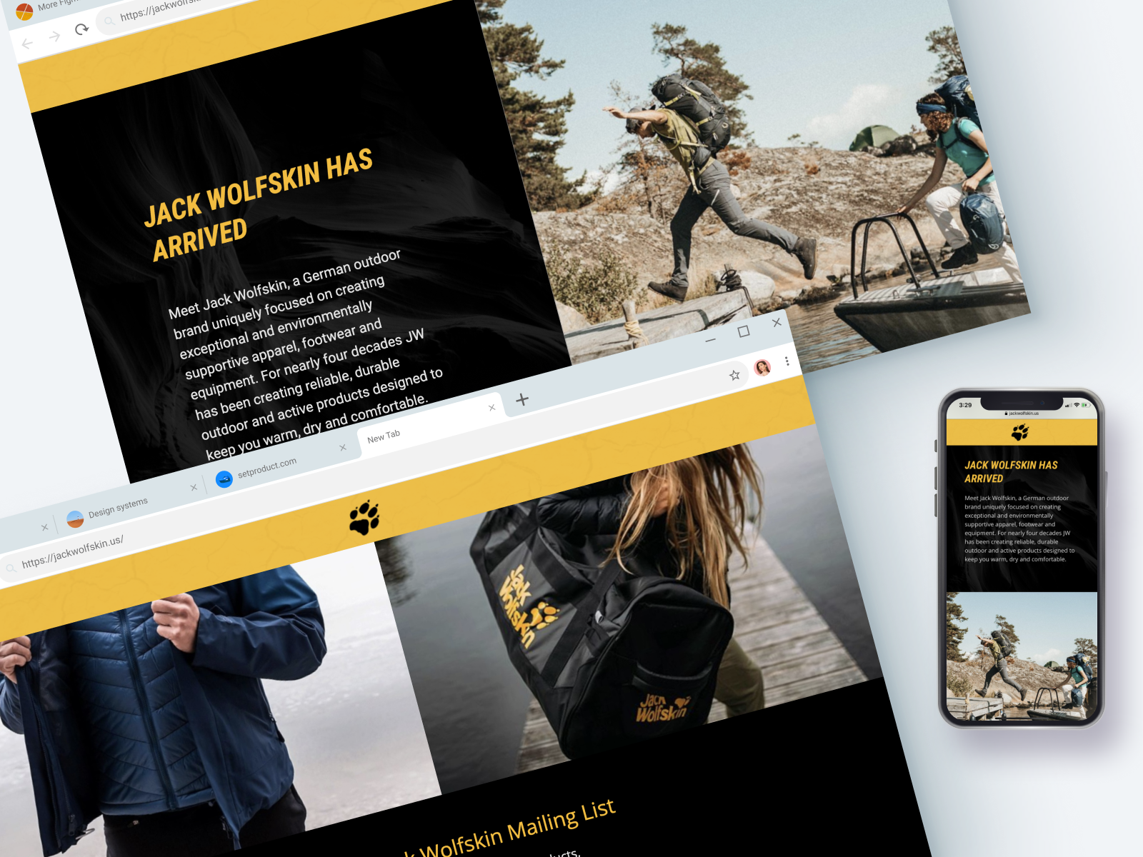
We created a marketing page to introduce the brand to the market. With the help of a Visual designer, we designed the page with the target in mind to capture emails.
Introducing the Brand to the Market
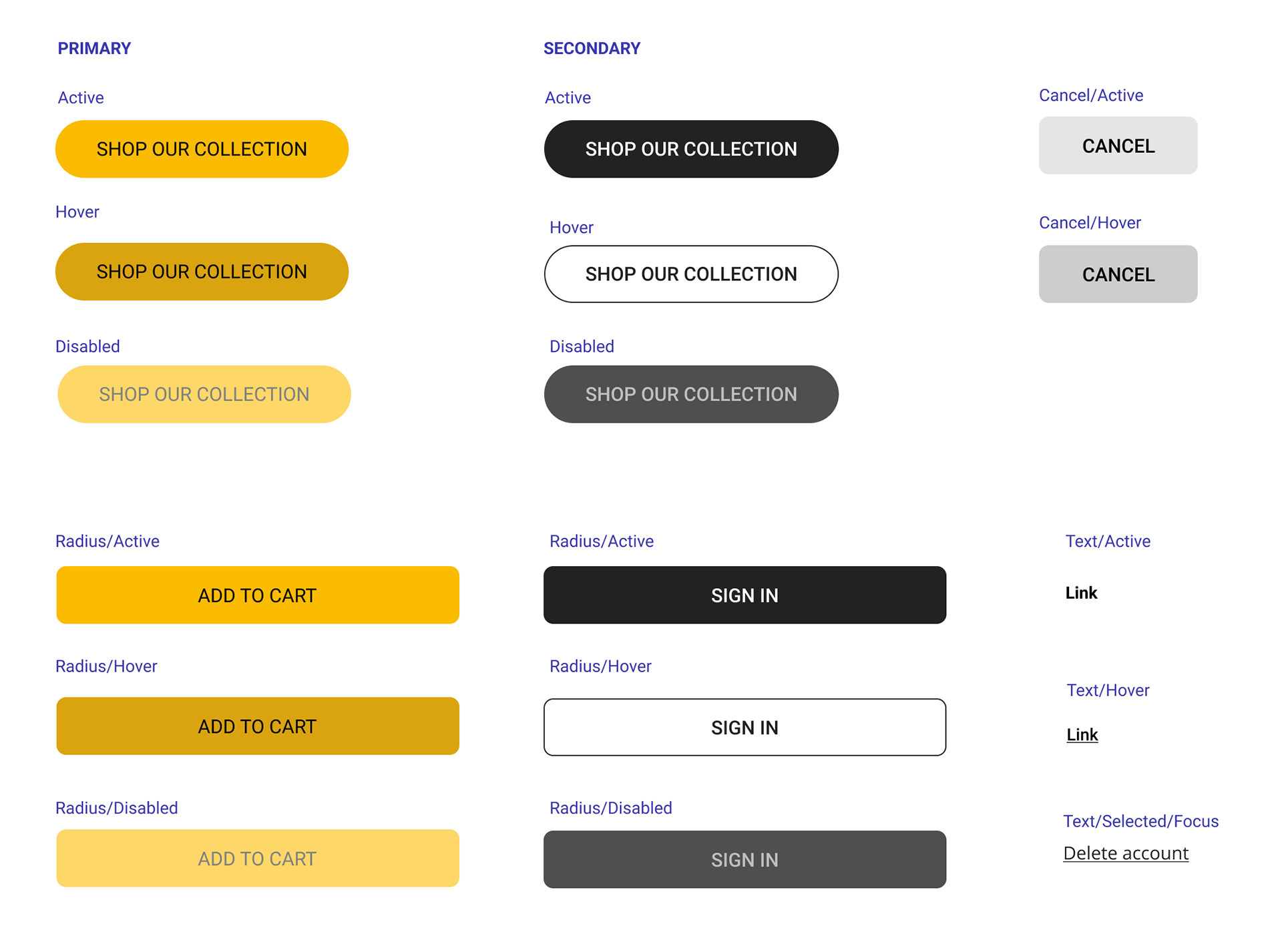
Design library
I created the design library from scratch using existing assets, such as typography
and color palette, and improved some other elements to comply with ADA. A lot of the font sizes currently used by Jack Wolfskin Europe are too small for people with low vision impairment. Additionally, some focus states are not defined, which makes it hard for people with motor disability to navigate the website. The color yellow had to remain, as well as the Italic font.
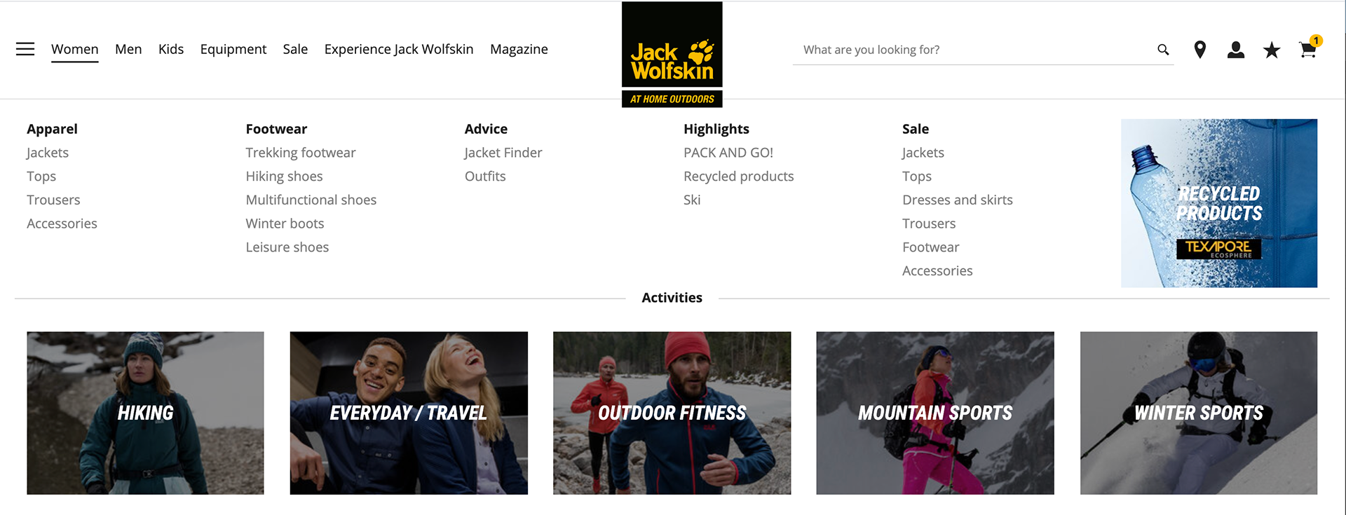
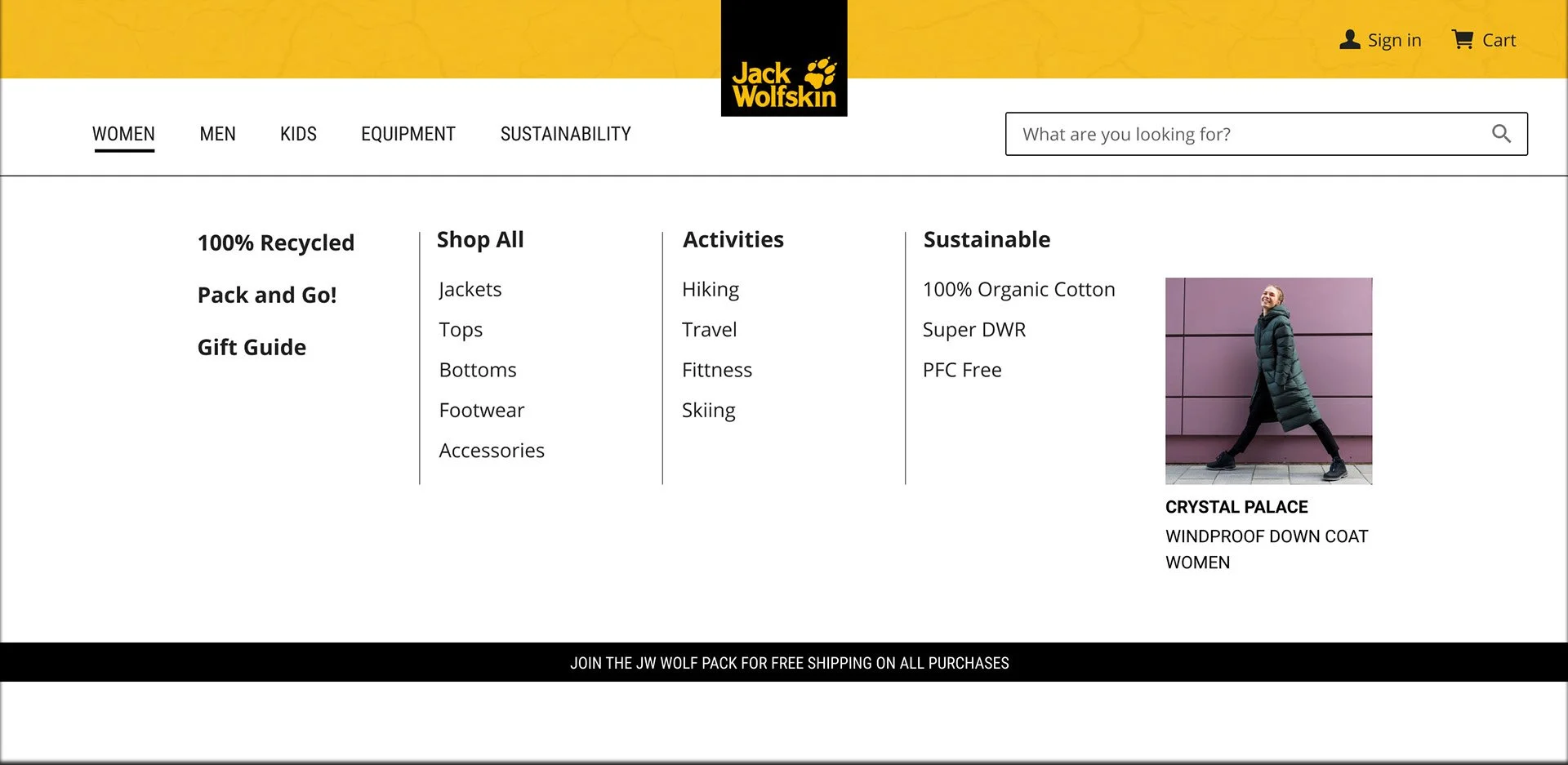
Main navigation
Jack Wolfskin European website navigation
Hybris template to work from
IDENTIFIED PROBLEMS
The European website is not easy to navigate
The hamburger menu is repeating what’s in the main menu. Users do not gain anything more from clicking on it.
The logo being centered does not allow enough space between the different sections hence does not really respect the Gestalt law of Proximity.
Jack Wolfskin logo is higher than wider and the team in Europe did not want to compromise on the size of the logo which is understandable.
Problem with the template format
USABILITY TESTING
I conducted gorilla testing with the logo centered and the logo aligned to the left. I tested the prototypes in person with six different people, asking them questions such as: where would you click to find women’s pants? Subsequently, I assessed their speed in navigating to that particular section and compared it to the alternate version.
Gorilla testing
Version with logo centered
Version with logo on the left
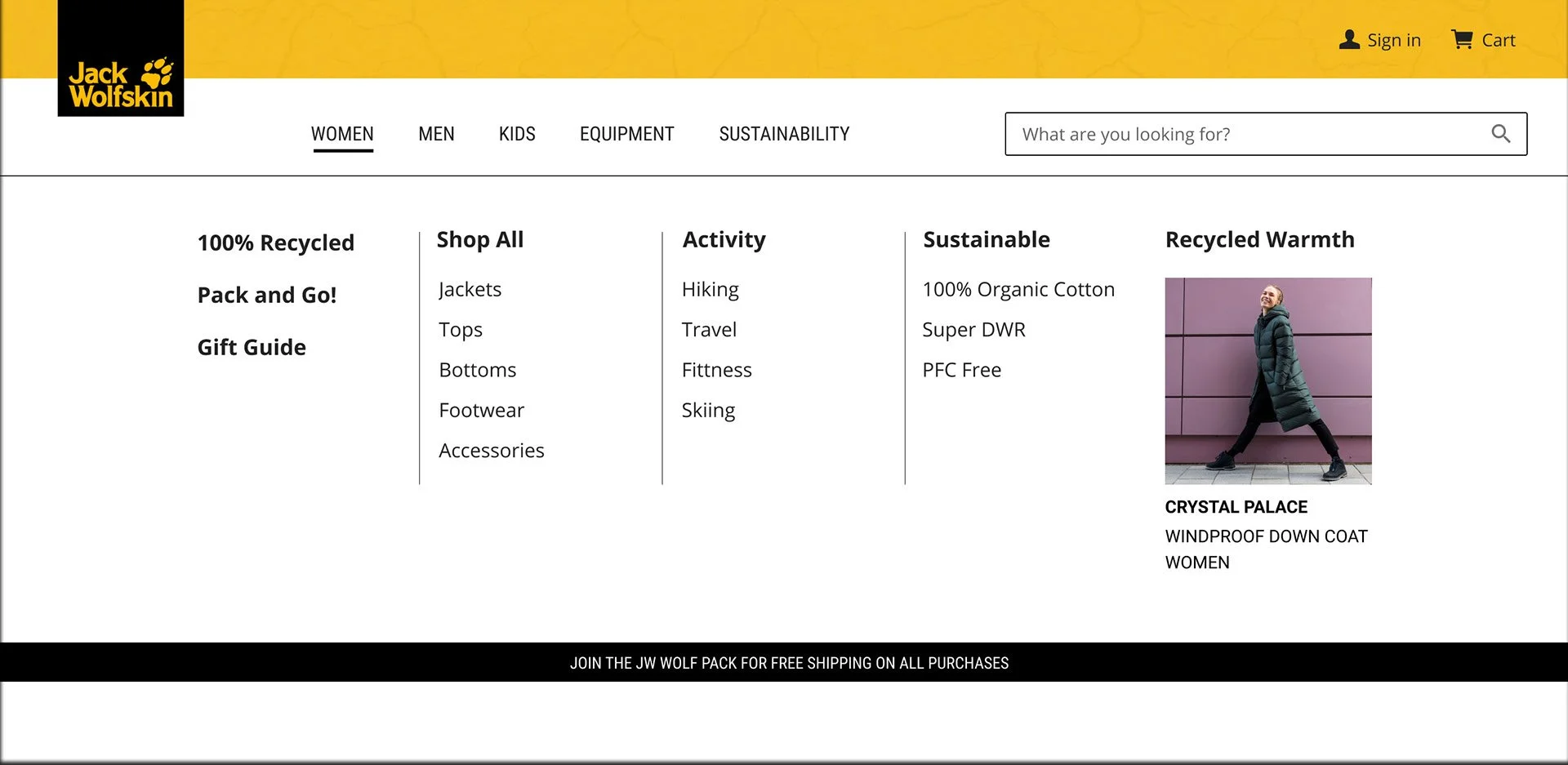
100% of the participants found what they were looking for faster with the logo on the left.
Results
The Hybris dev team agreed to modify the nav, and this final version was approved by Jack Wolfskin Germany for us to go ahead and implement. We were also approved to use the other version of the logo on mobile, which was more user-friendly.
After seeing the results, the team in Germany decided that they would also move to a left-sided logo in the future, which they did www.jack-wolfskin.de
Final proposition


PLP pages
JW image assets are square PNG files with a transparent background.
We used the Hybris template for other pages with has a 20px left margin which we want to keep consistent.
Constraints
Jack Wolfskin Europe
Hybris template
Goals
Fit square images within the Hybris template without having to make too many modifications.
Content editors should be able to implement elements easily into the CMS.
USABILITY TESTING
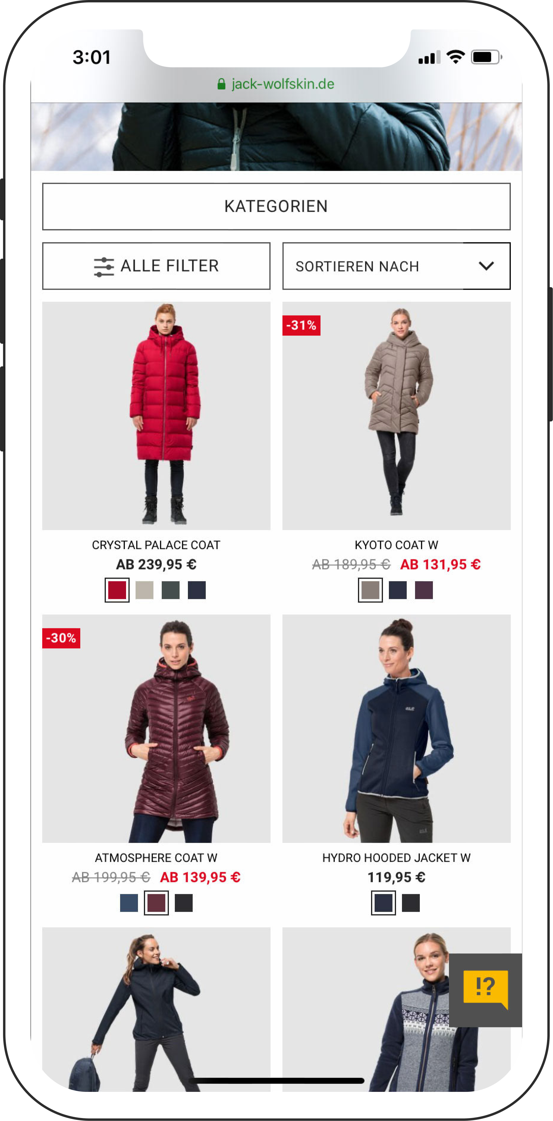
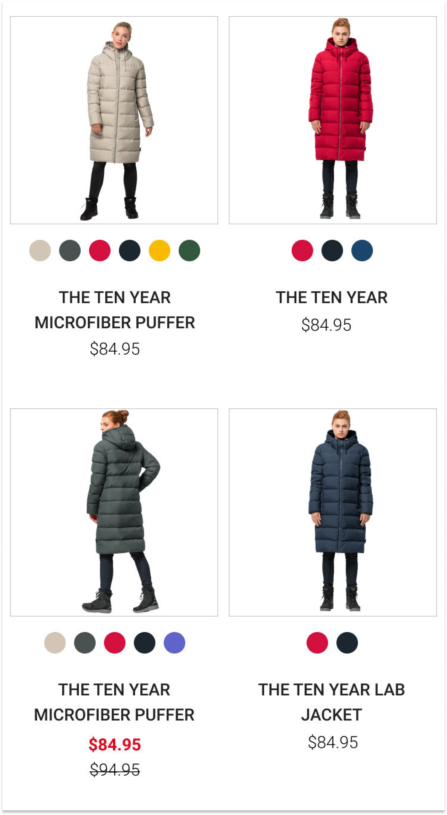
After analyzing goals and constraints I crafted 3 layouts. I asked the participants which layout they were more comfortable with.
The layout that is closest to JW Europe is Layout 1. Layout 2 permits the use of all images without the inclusion of a gray background which may not be compatible with all assets.
Gorilla testing
Layout #1
Layout #2
Results
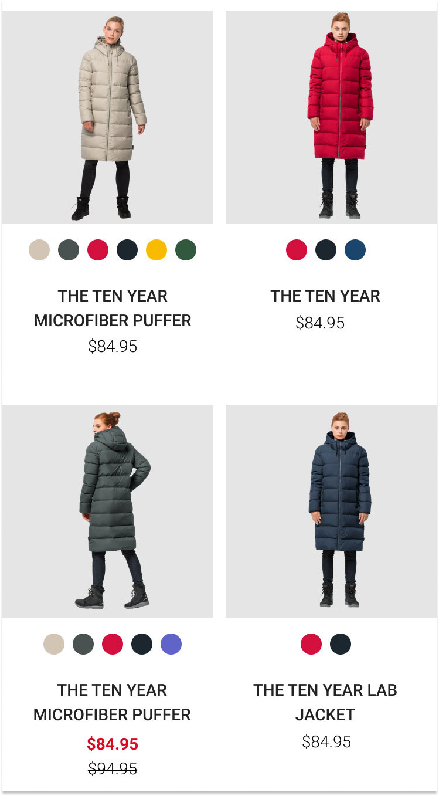
60% of the participants were more comfortable with the gray background.
"It's more visible with the gray background."
Iteration
I then added layout 3 and tested layouts 1 and 3. Layout 3 provides additional space for the models as some of them appear cramped.
Layout #1
Layout #3
Results
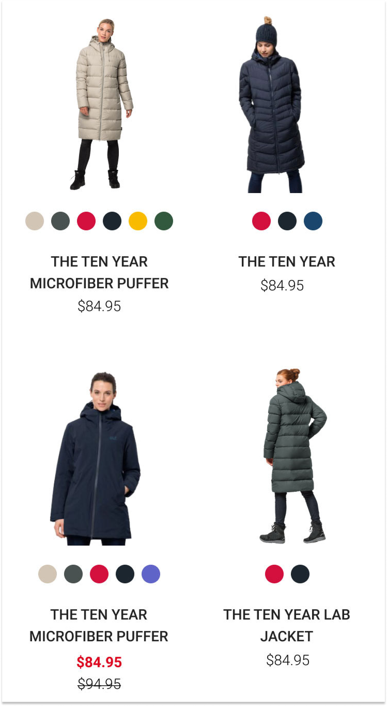
80% of the participants said layout #3 was more lisible, and had no problem identifying each product.
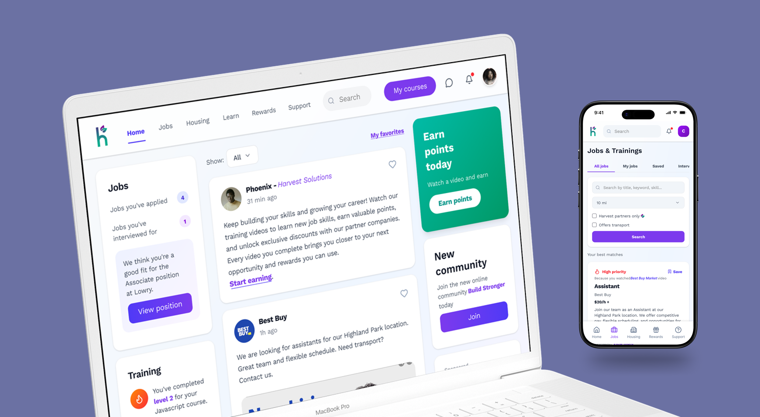
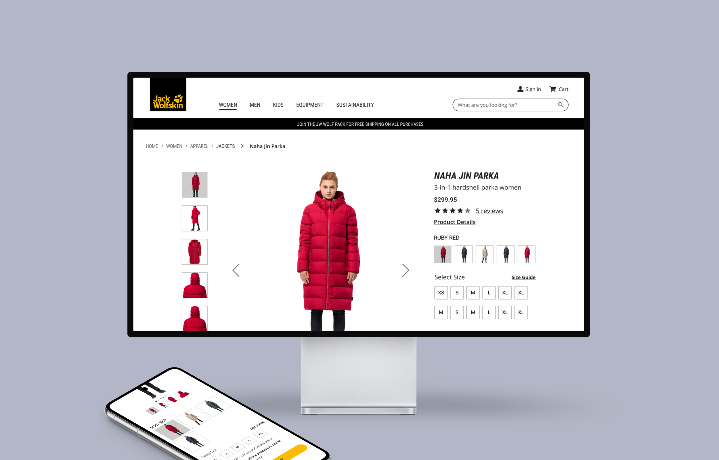
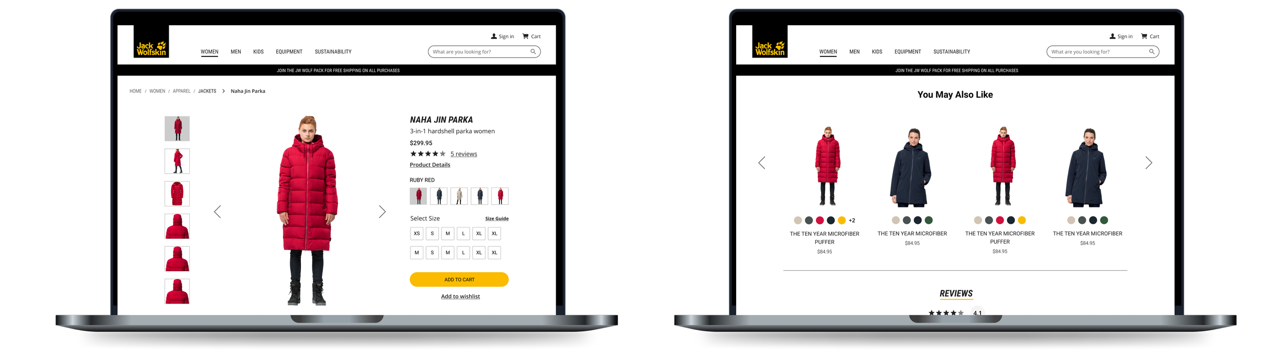
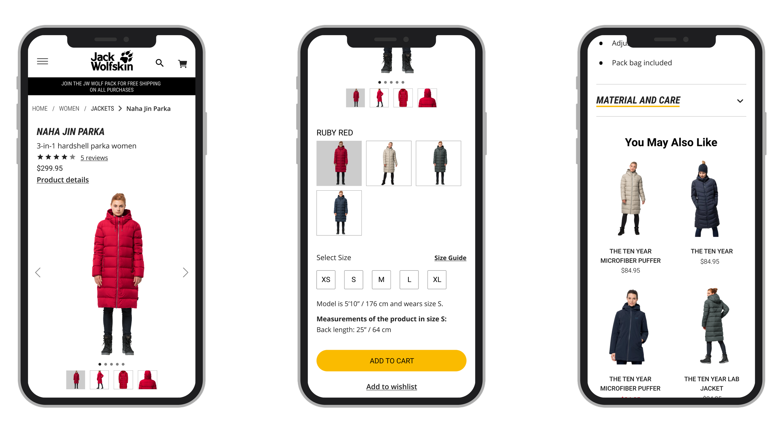
PDP pages
Jack Wolfskin Europe

Jack Wolfskin US
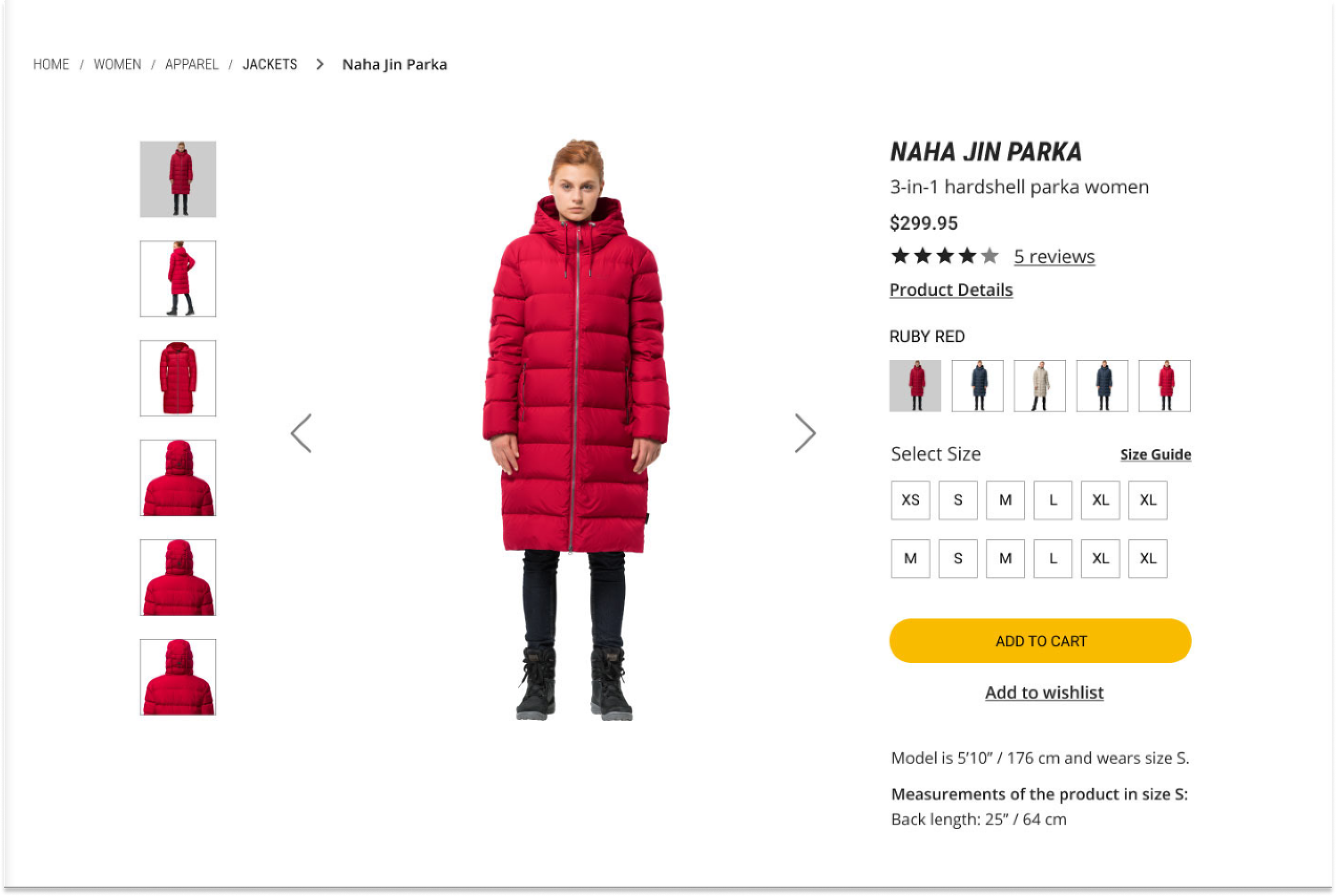
High fidelity design
Other Projects
Health tech