Health Tech
Product Strategy / Research / UX
My role
Product / UX Design & Strategy
The team
Project Manager, engineers, illustrator, and senior UX strategist
Context
Academics approached our venture studio to develop an app for vestibular patients. A founder was appointed to the project.
Date
2023 onwards
OVERVIEW
A budgetary constraint quickly appeared as a challenge. We strongly recommended conducting preliminary research and usability testing, but they decided to go straight into final designs without any testing. We pushed forward, hoping for the best, with only assumption to guide us.
Constraints
The primary target market for the initial launch is private physical therapy clinics.
Target audience
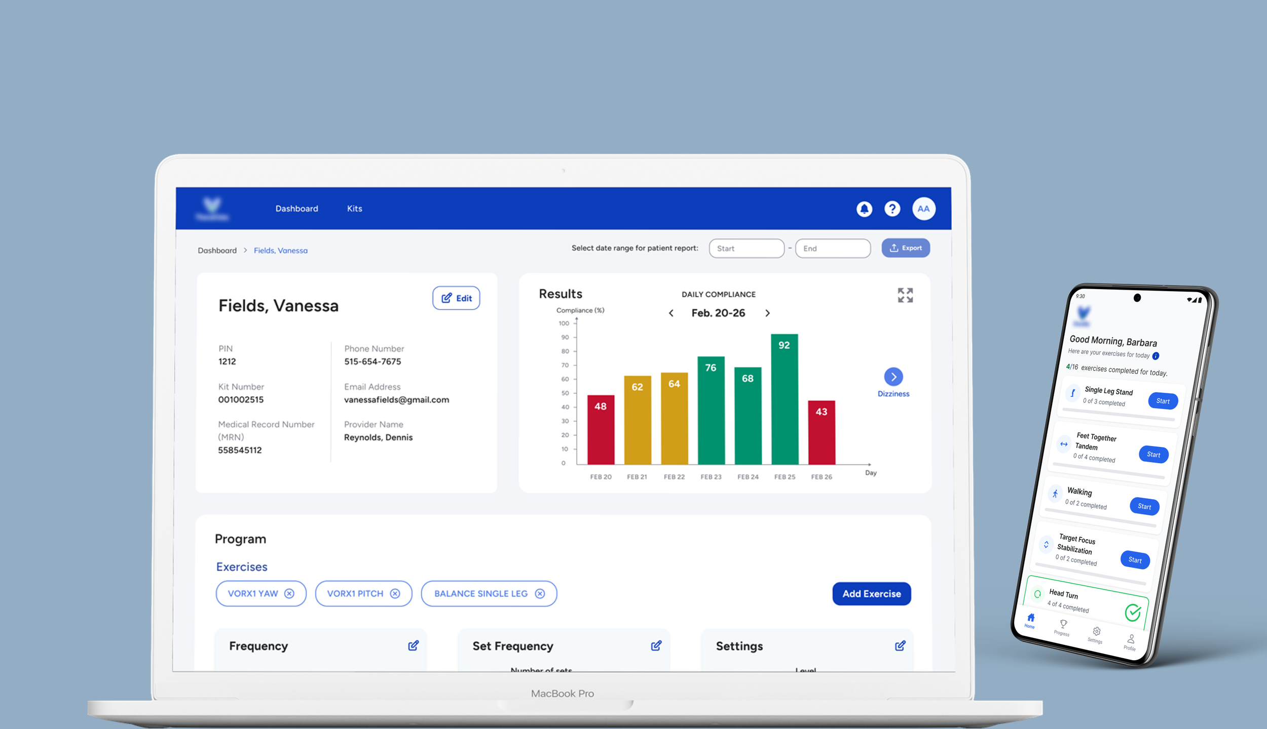
The physical therapists will have access to a portal to set up exercises and the client will access an admin portal to manage and assign kit tablets. Additionally, a tablet app will be developed for patients to take home. I was responsible for designing the physical therapist and admin portals, with limited involvement in the tablet application design.
What we built
Other than moving directly into high-fidelity design without foundational user research, the desirability or viability of a tablet-based solution was not validated with physicians or patients. As a result, early decisions were driven by assumptions rather than confirmed user needs.
Main challenges
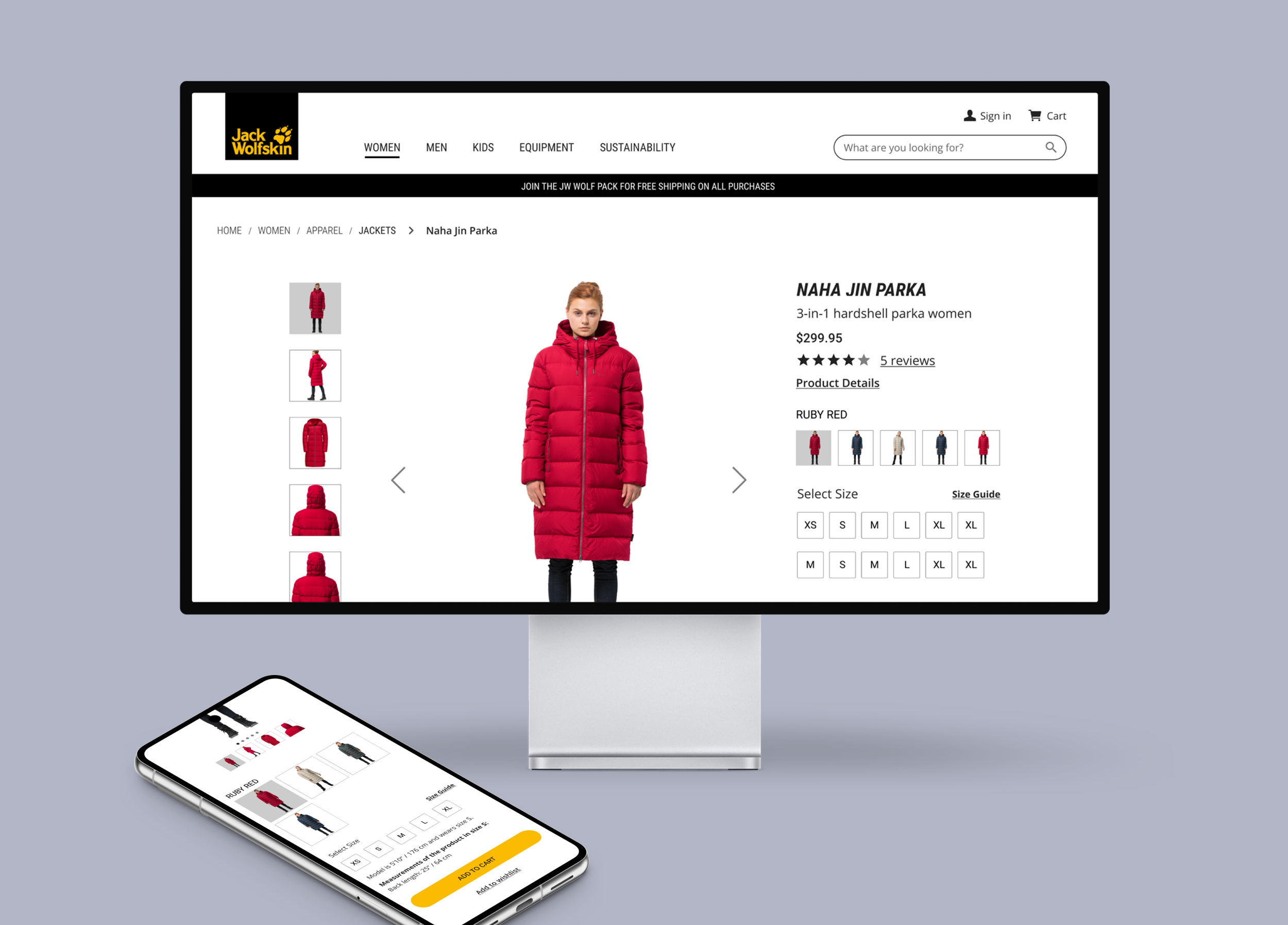
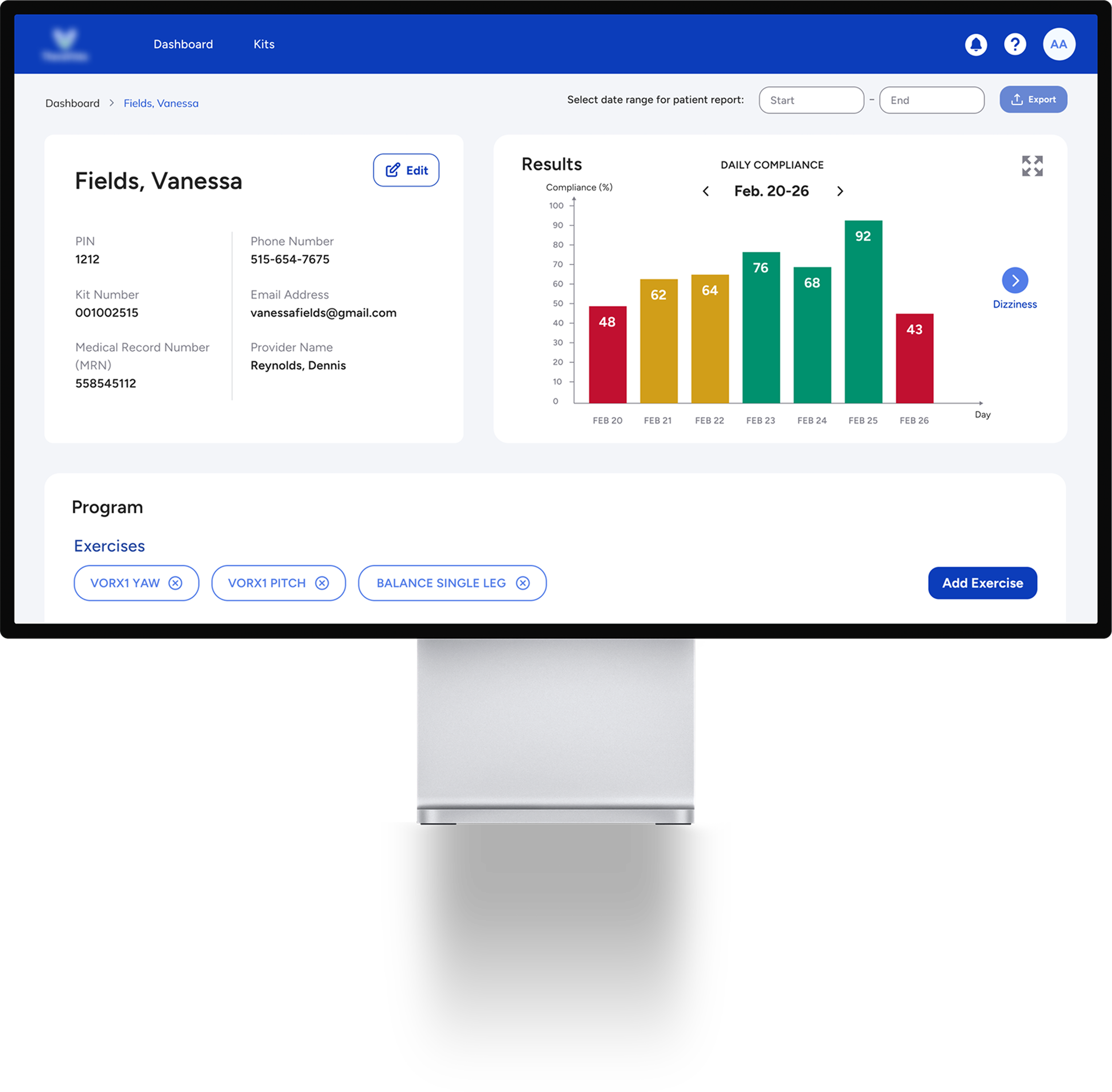
High fidelity screens
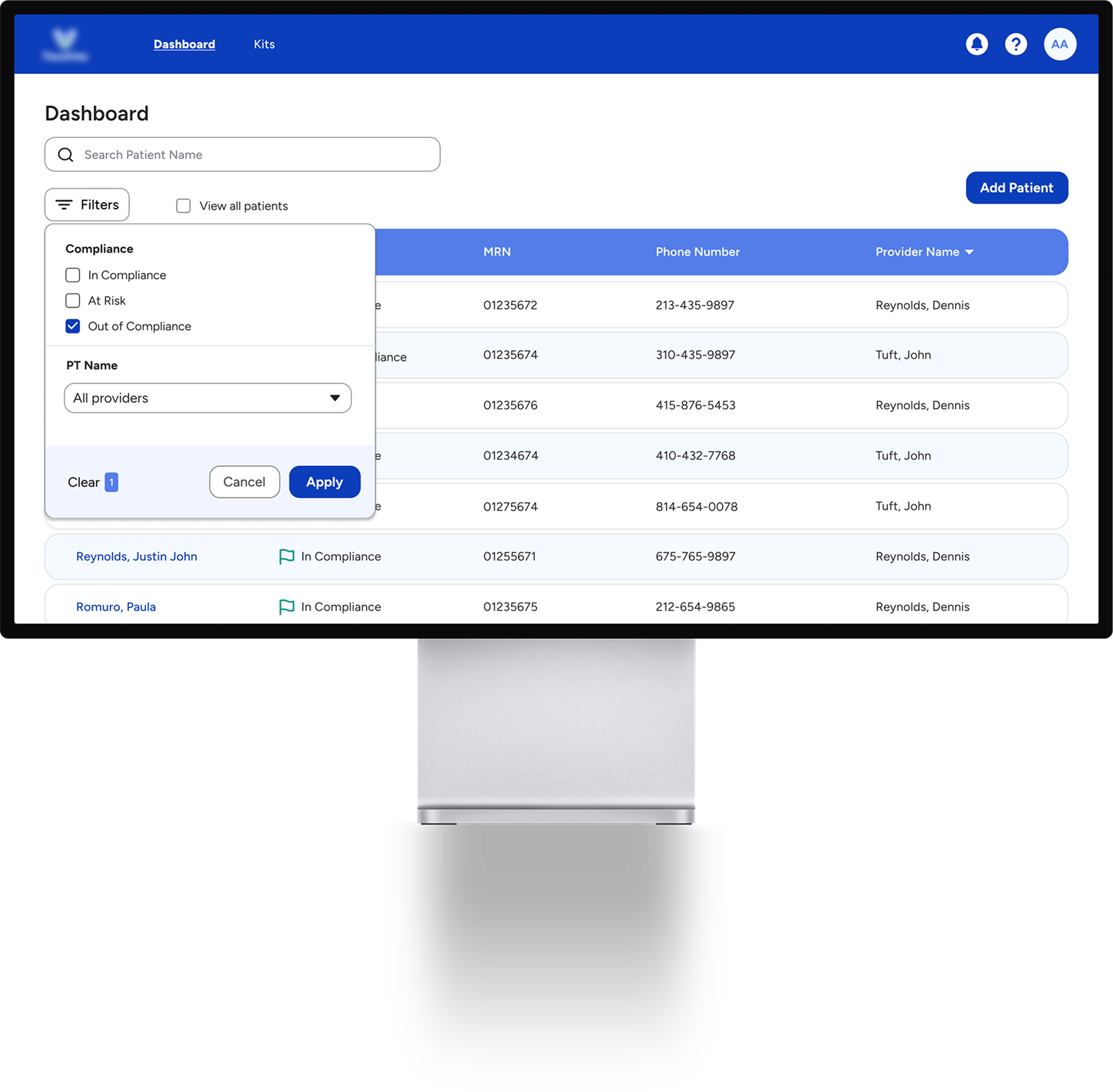
Portal screens (Physical Therapist)
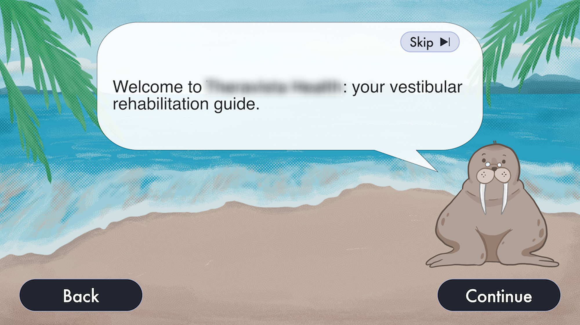
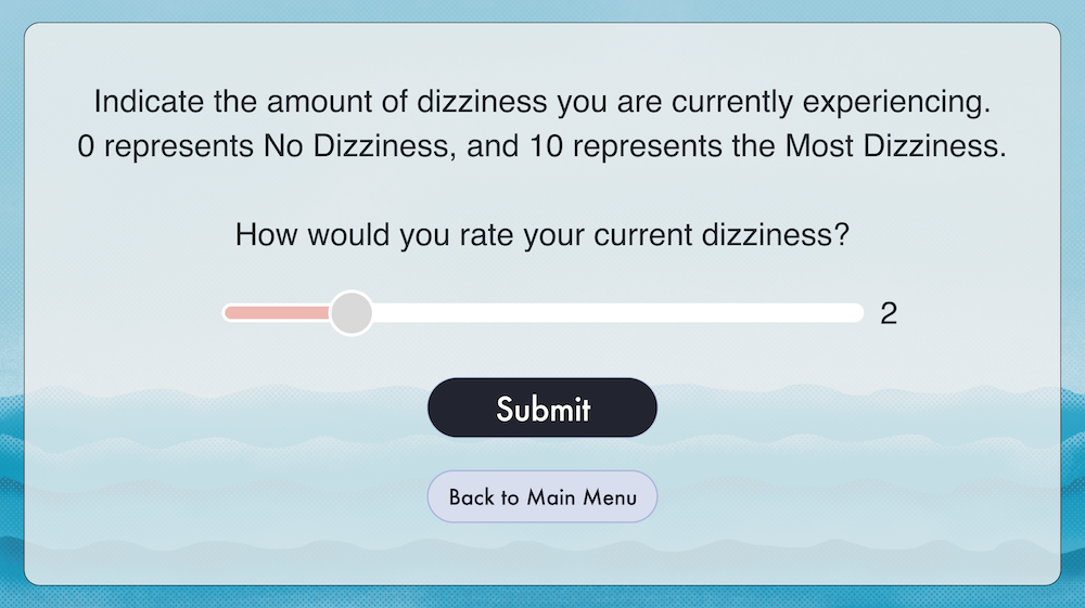
Tablet for patients (designed by someone else)
RESULT
Launch in pilot clinics
A few physical therapy clinics tried the portal and tablet as part of a pilot program. To our relief, the physical therapists found the portal fairly easy to interact with and set up exercises. However:
Very few patients got a hold of the tablet, and those who did found it difficult to use, therefore making it challenging for them to concentrate on the exercises.
Moreover, the tablet proved to be inconvenient to carry around, adding to their frustrations.
RESEARCH & ANALYSIS
Seeing the launch did not come out as the client expected, they came back to us to analyze what went wrong. Due to time constraints and budget, we decided to prioritize user research. We reached out to various PTs (some who tried the platform and some who did not) across the country, from the general clinic to concierges, and conducted interviews. I asked to see their business model and market research before diving into UX research.
Market research & Business model analysis
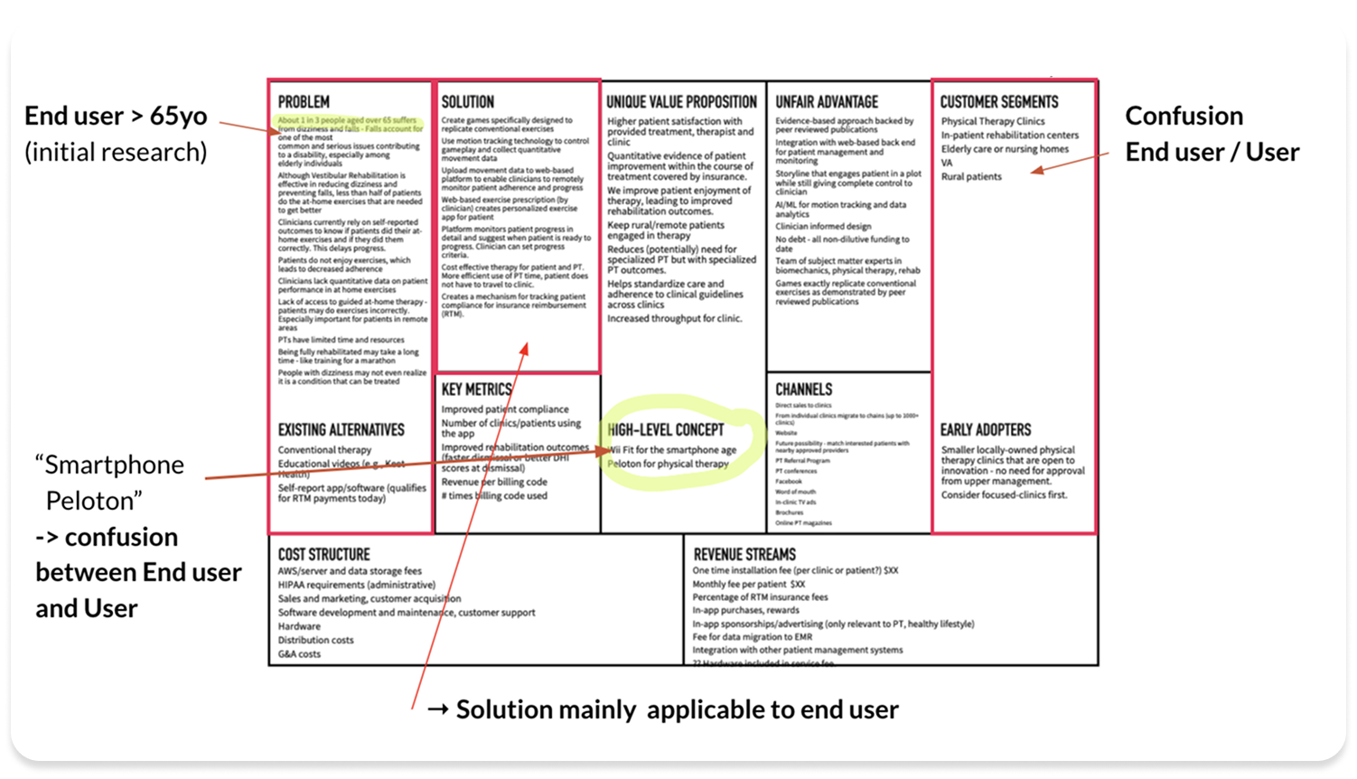
Findings
Buyer vs User misalignment
The product’s value proposition is focused on patient outcomes and compliance but the targeted buyers are clinic managers
Growing market but low awareness
Vestibular market is anticipated to expand, however there is a lack of knowledge from the public about physical therapy as a dizziness treatment, which creates an adoption barrier.
Unclear target market
Focused broadly on physical therapy rather than vestibular-specific.
I conducted user interviews with my colleague.
User research
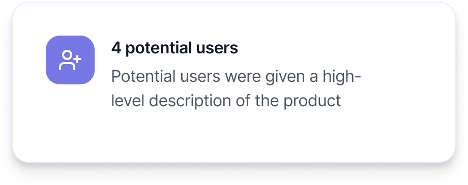
Findings
Only 5% to 40% are vestibular patients in general clinics
“The price wasn't worth the amount of use that we would necessarily get out of it” B
Concerned with the tablet being lost or not returned
“What if the tablet gets lost or not returned?” S.
“If I own the tablet, need to make sure I can get it back from the patient”K.
Preference for an app form
“Would love to have it in app form so I didn't have to have tablets in clinic. If it was in app form, I would tell patients to download it.” H.
"I think an app would be more practical than a tablet [...] You have to take this big box home” D.
Recommendations to client (from user+market research)
Redefine market segmentation: focus more specifically on vestibular rehab practionners and small clinics. Consider concierges.
Define value-proposition: adapt sales/marketing messaging to PTs (benefits vs loss aversion). One that 1) saves them time significantly and quality of treatment is the same, OR 2) Improves quality of treatment significantly even if takes more time
Move to a native mobile app: reduce barrier to adoption
Show patient progress: provide quantitative, objective measurements of patients’ progress
Create independent exercises: do not group prescriptions/treatment with general diagnoses
Emphasize patient safety: include in-app information for fall prevention and exercise limits based on symptoms.
Fast forward: New team, New direction
Several months later, the whole team has changed, as well as the direction of the project.
New direction:
Patients will be able to download the app on Google Play
The app is emphasizing safety, and shows patient progress
PTs will assign independent exercises to each patient
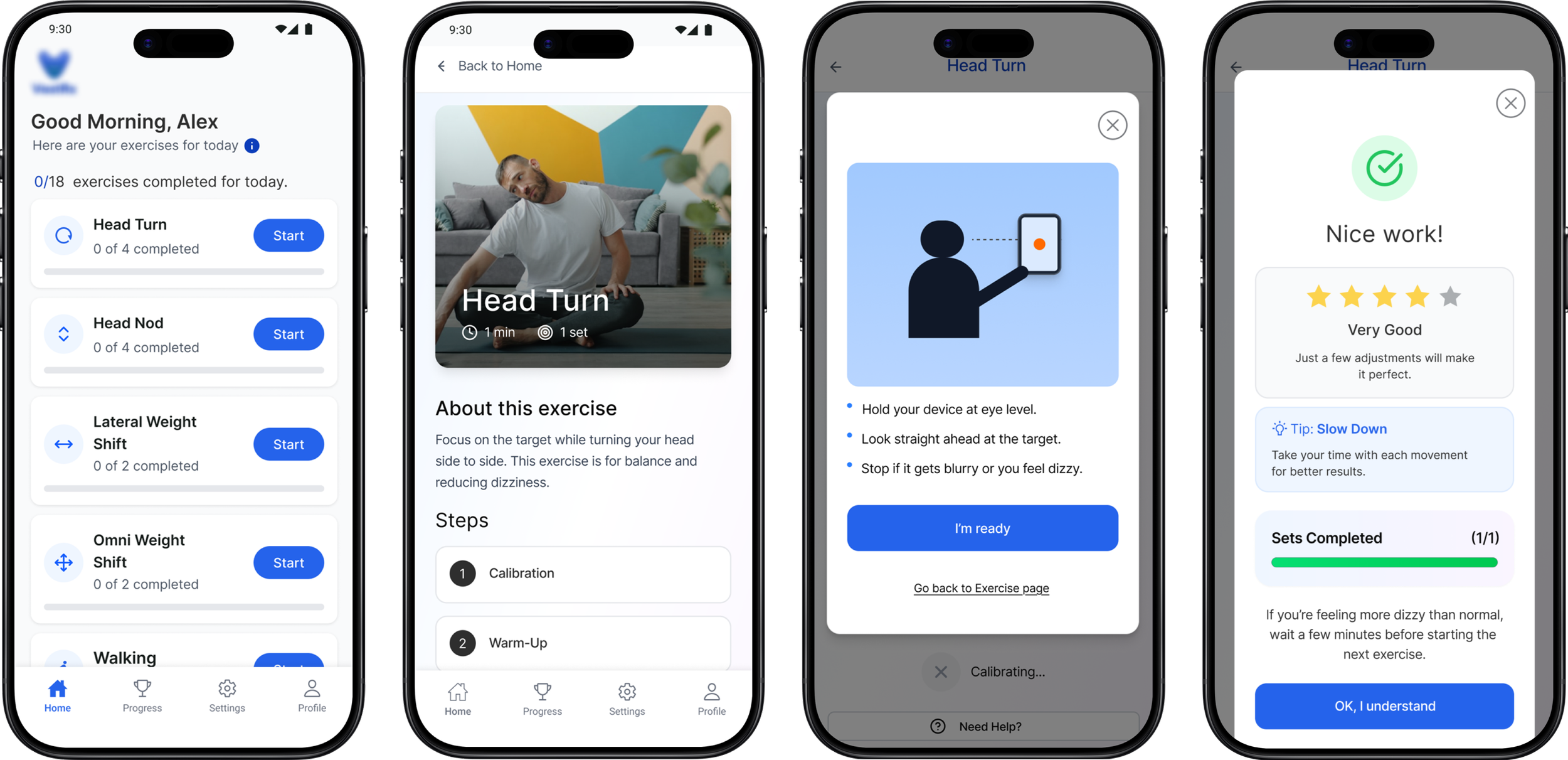
The following prototype shows how a patient can complete an exercise. The new team had started creating screens and wanted help with the UI. I updated the existing screens, changed the UI completely, and the UX. This is MVP and it needs to be tested.
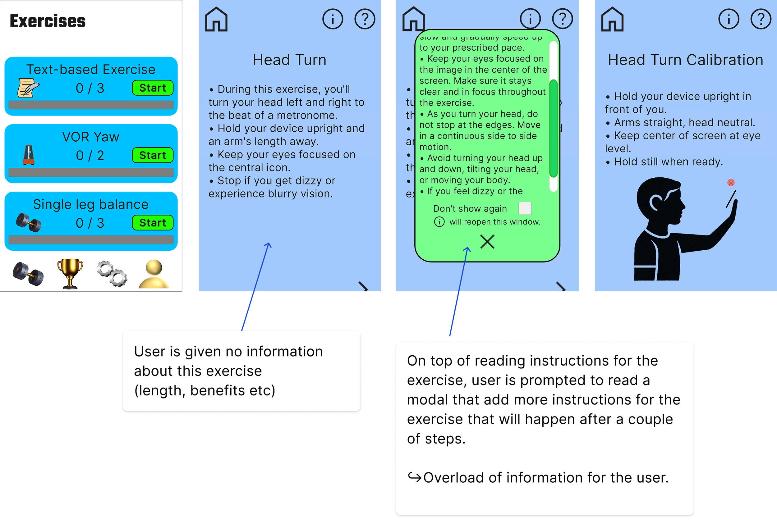
UX issues and iterations
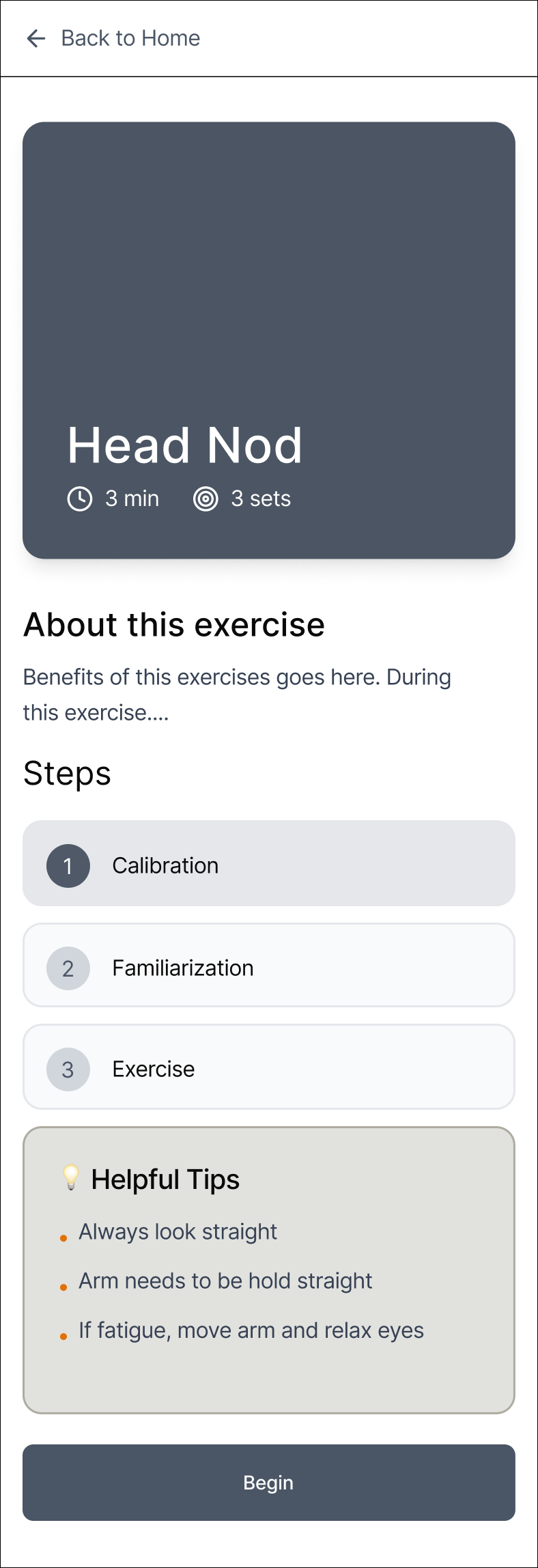
Iteration
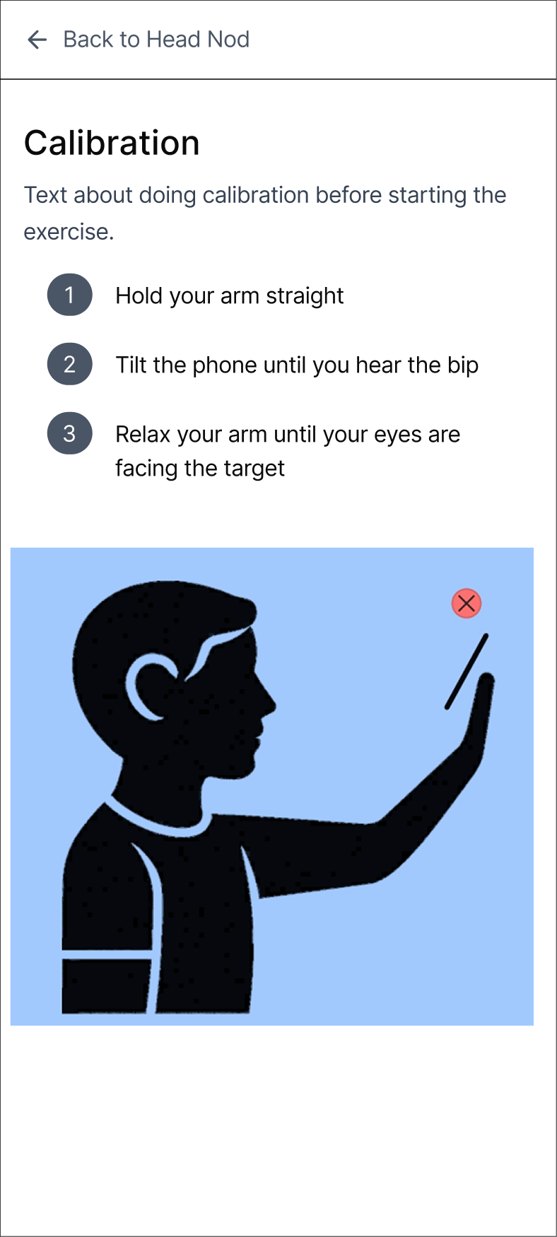
User is given information that they would
need in the moment and what to expect
with clear steps.
Helpful tips that apply across the exercise.
High fidelity screens
💡 Lesson learned
Never assume that entrepreneurs and executives did their due diligence before starting to build a product. It will avoid wasting money on building the wrong thing.
Other Projects
Social tech